Google Material M3 Expressive Design
Joi JetsonThe 87% Reality Check
Here's the stat that validates everything: 87% of people aged 18-24 favor expressive communications in design. Google didn't just update their design system - they backed it with research showing that emotional and expressive storytelling in UX is most effective.
The correlation between visual appeal and intention to use isn't coincidental. When Joi describes the new Material 3 interfaces as looking like "sugary candy treats," she's hitting on something fundamental about how users want to interact with digital products.
Material 3 Design Evolution
The new Material Design 3 system brings gradient-heavy interfaces, micro-animations, and a shape library that feels alive. Joi breaks down the key elements:
Purple as Brand Unifier: Purple becomes an anchor point across designs, creating visual cohesion while maintaining expressiveness.
Button Evolution: From completely rounded buttons to "fluffier rounding" that feels more approachable than Apple's perfect radii.
Micro-Animations: Wavy bars, floating action buttons that expand beautifully, and interactions that add delight without sacrificing function.
The Genius Circle Cursor
One standout feature Joi highlights is the circle cursor hover effect that inverts text for visibility. It's the kind of thoughtful interaction design that elevates the entire user experience - something you can "look under the hood and use in portfolios."
Built for Figma Integration
The Material 3 library is already integrated into Figma, making these expressive design elements immediately accessible to designers. No more waiting for design system updates - you can prototype with these components right now.
Why This Matters for Design
This isn't just about prettier interfaces. Google's research validates the shift from sterile, minimal design to expressive, emotional interfaces. The data shows users don't just prefer expressive design - they're more likely to use products that feel engaging and alive.
For designers working on modern UX projects, this represents a fundamental shift in how we approach interface design. The era of boring UI is officially over.
Catch the full breakdown where Joi explores the shape library, discusses the do's and don'ts guidelines, and explains why this design system update represents more than aesthetic changes. Available on all podcast platforms and our podcast archive.
Episode Links:
- Episode 2: GSAP, Interaction Design & Animation Inspo - Perfect follow-up on expressive design trends
- Episode 6: Buying Data on AWS & Grok Epic Fails
Related Products:
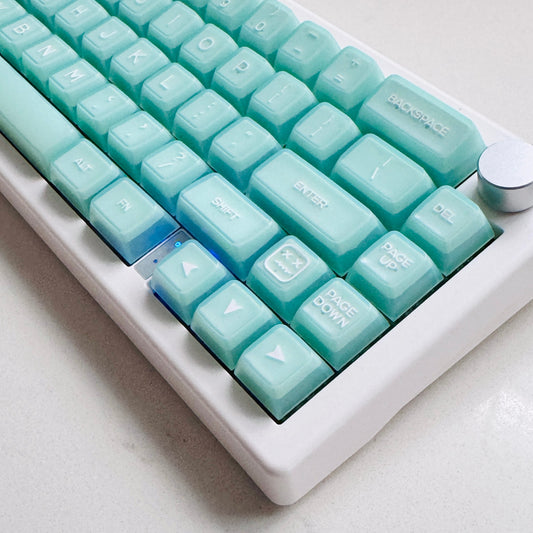
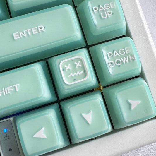
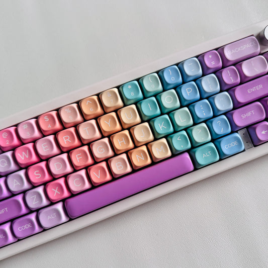
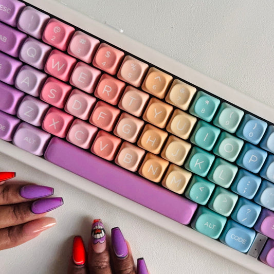
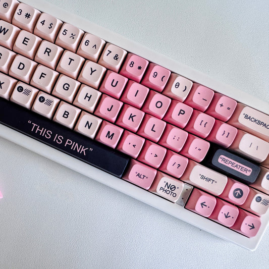
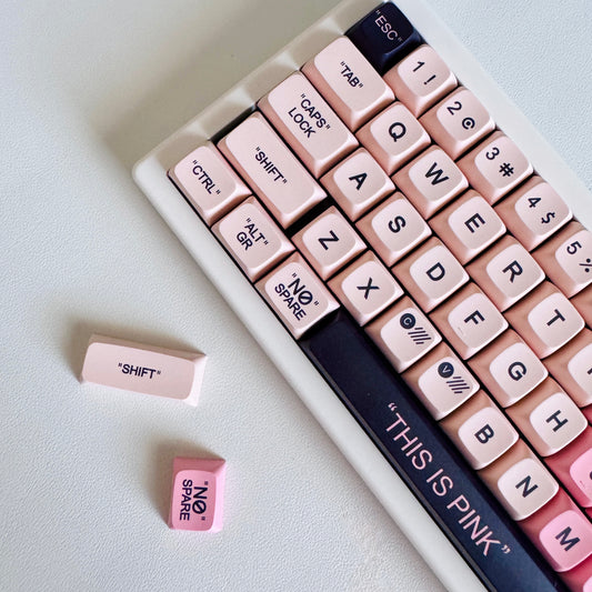
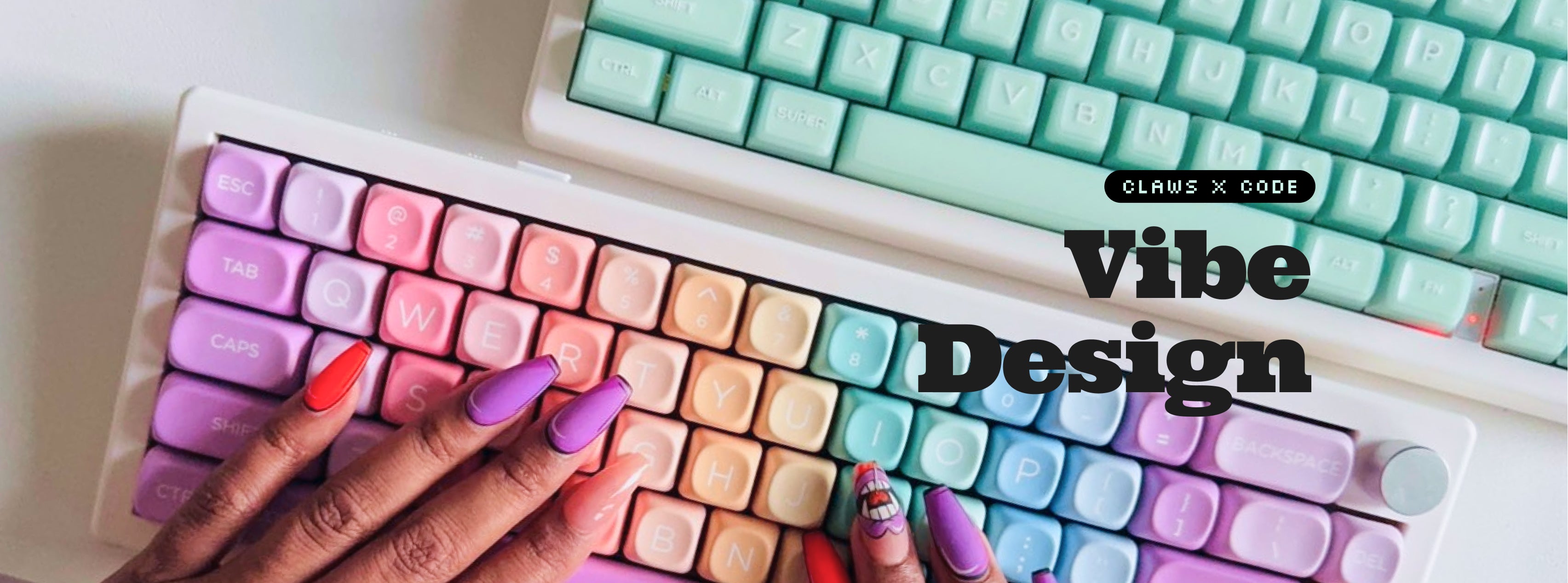
- Custom Keyboard Collection - Express yourself through tactile design
- Tech Accessories - Add expressive elements to your creative workspace